Live Conversations
This feature is enabled on a per-company basis. For more information on how to enable this feature for your company, please contact your Customer Success Manager.
In addition to being enabled for your company, you also need to have been granted access to the feature. This is done by users that have access to the User Management feature in your company.
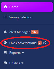
If you have access to the Live Conversations feature, you will see a new tab in the left-hand navigation menu.
Live Conversations Notifications
If you have been granted access to the Live Conversations feature, a company administrator can configure for which point of contacts you will receive notifications for live conversations and how you will receive them.
For more information on how to configure live conversations notifications, please see the User Management documentation.
Live Conversations Page
Upon clicking the Live Conversations tab, you will be redirected to the Live Conversations page.
This page is responsive, meaning that it will adapt to the size of your screen.
However, this only changes the layout of the page, not its features. Every feature of the Live Conversations page is available on all screen sizes; the only difference is how to access them.
There are three available screen sizes for the Live Conversations page:
Large Screen (Desktop)
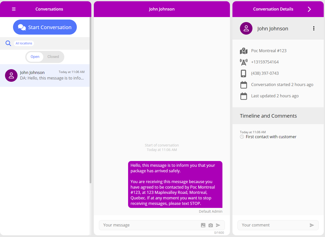
On a large screen, all three panels (Conversation List Panel, Conversation Panel, and Conversation Details Panel) can be visible at the same time.
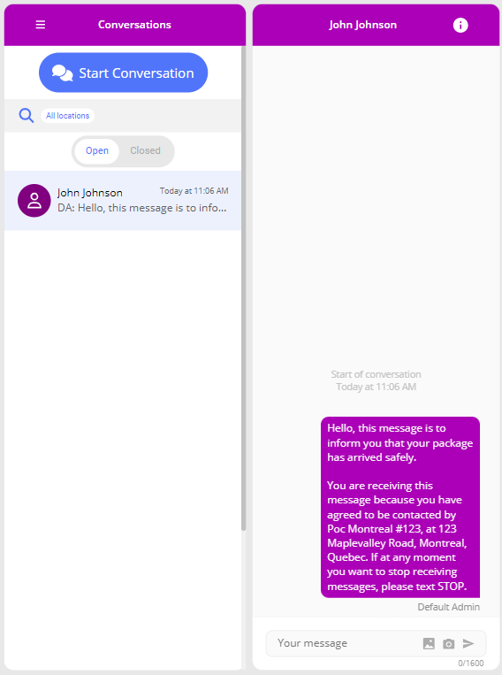
Medium Screen (Tablet)
On a medium screen, only two panels can be visible at the same time. The Conversation Details Panel will slide on top of the Conversation Panel instead of pushing it.
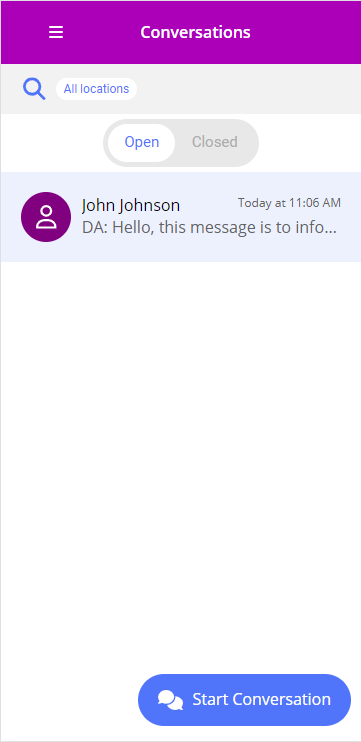
Small Screen (Mobile)
On a small screen, only one panel can be visible at a time. Furthermore, the Start Conversation button is now located at the bottom right of your screen.
Since all screen sizes are very similar, the subsequent sections will describe the layout of the Live Conversations page on a small screen. Notable differences on larger screens will be mentioned.
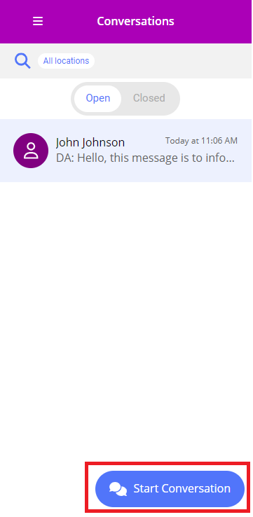
Conversation List Panel
The Conversation List Panel is the leftmost panel on the Live Conversations page on medium and large screens. On small screens, it is the first panel you will see upon entering the Live Conversations page.
Filter Section
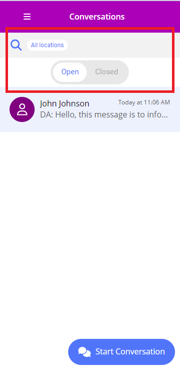
By clicking on the grey bar at the top of the Conversation List Panel, you can open the filter section. This section allows you to filter the conversations displayed in the Conversation List.
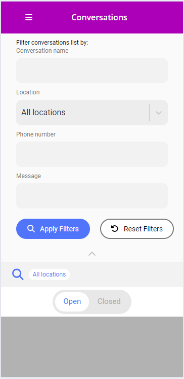
You can filter conversations by:
- Conversation Name: Only show conversations with a specific conversation name.
- Location: Only show conversations assigned to a specific point of contact.
- Phone Number: Only show conversations with a specific phone number.
- Message: Only show conversations that have a message containing the specified text.
To apply the filters, click the Apply Filters button. To reset the filters to their default values, click the Reset Filters button.
Clicking the Apply Filters button will close the filter section and the Conversation List will be updated to reflect the new filters. You can also close the section by clicking on the upward arrow located on the right under the button or by clicking on the Conversation List.
Applied filters will appear in the grey section at the top of the Conversation List Panel.
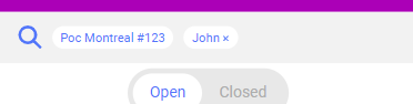
If you have applied filters other than the Location filter, you can remove them by clicking on the X button located next to them in the grey section. Doing so will also update the Conversation List to reflect the new filters.
Furthermore, you can also toggle between viewing open and closed conversations by clicking on the Open or Closed buttons located under the filter section. See the Closed Conversations section for more information on closed conversations.
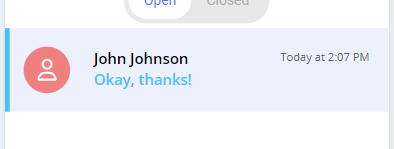
Conversation List
Here you will see a list of conversations ordered from newest to oldest. Each conversation will be assigned a random color to help you identify it more easily.
Each conversation list item will display the following information:
- The conversation's title (if it has one)
- If the conversation does not have a title, the customer's phone number will be displayed instead.
- The timestamp of the last message sent or received in the conversation.
- A preview of the last message sent or received in the conversation.
- If the preview is too long, it will be trimmed, and an ellipsis will be added at the end.
- If the previewed message contains no text but has at least an attachment, the message's preview will be replaced by Sent Attachment(s).
- If the last message was sent by a user of the platform, the preview will start with the user's initials followed by a colon.
Unread conversations will be marked with a blue vertical line on the left side of the conversation list item, their title will be bold and their message preview will appear blue.
Starting a Conversation
There is also a Start Conversation button at the bottom right of the Conversation List Panel. This button is always visible, no matter how far you scroll down the Conversation List.
Note: On medium and large screens, the Start Conversation button is located between the panel's header and the filter section. Upon clicking the button, the Start Conversation modal will replace all other panels on the page.
Upon clicking the Start Conversation button, the Start Conversation modal will open. This modal allows you to start a new conversation with a customer.
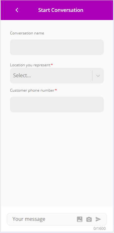
Here, the user must specify the customer's phone number and must also select to which point of contact the conversation is assigned.
Optionally, the user can also give the conversation a title so it can be more easily identified in the Conversation List.
After filling in the required fields, the user must enter a message in the text box and click the Send button to start the conversation.
For more details on the message text box, see the Message Input section.
If you are attempting to create a conversation in a location that already has an existing conversation with the same phone number, you will be prompted to confirm that you want to start a new conversation or continue the existing one.
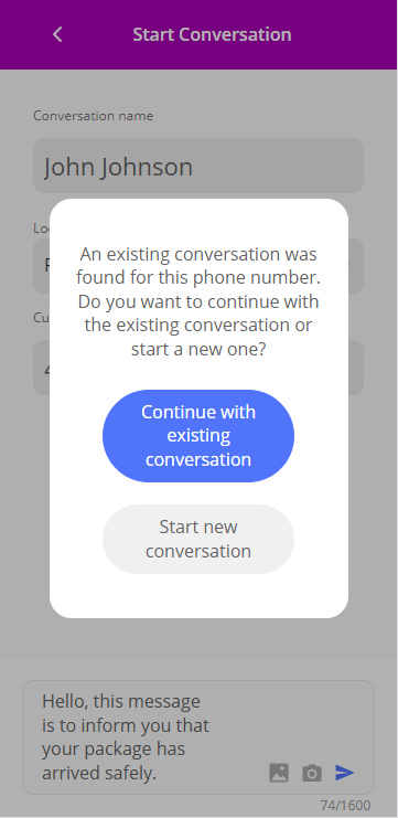
If you choose to start a new conversation, a new one will be created. If you choose to continue the existing conversation, you will be redirected to the Conversation Panel of the existing conversation. The existing conversation you will be redirected to will be the newest one, prioritizing open conversations over closed ones.
Note: If you choose to start a new conversation, any existing conversation(s) will not be automatically closed. You can close them manually by clicking on the vertical ellipsis icon located at the top right of the conversation's name in the Conversation Details Panel.
After successfully creating the conversation and sending the message, you will be redirected to the Conversation Panel, where you can continue the conversation.
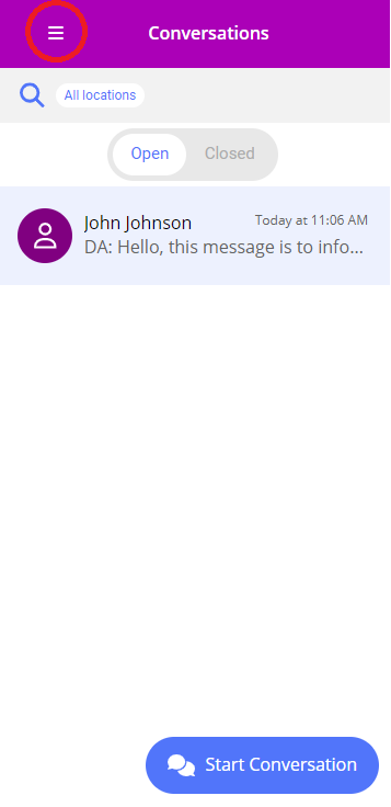
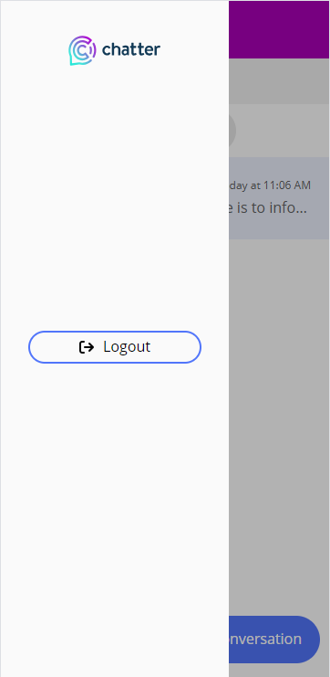
Burger Menu
At the top left of the panel, there is a burger menu that can be clicked to open a slide-in menu with a few options:
- Clicking on the Chatter logo will redirect the user to the Chatter home page.
- The Logout button will log the user out of the Chatter platform.
Conversation Panel
Conversation Messages
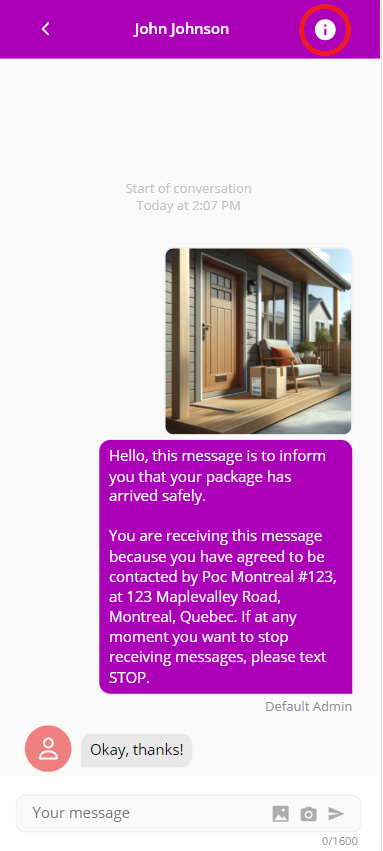
The main section of the Conversation Panel is the conversation messages. Here you will see all messages sent and received in the conversation, ordered from oldest to newest.
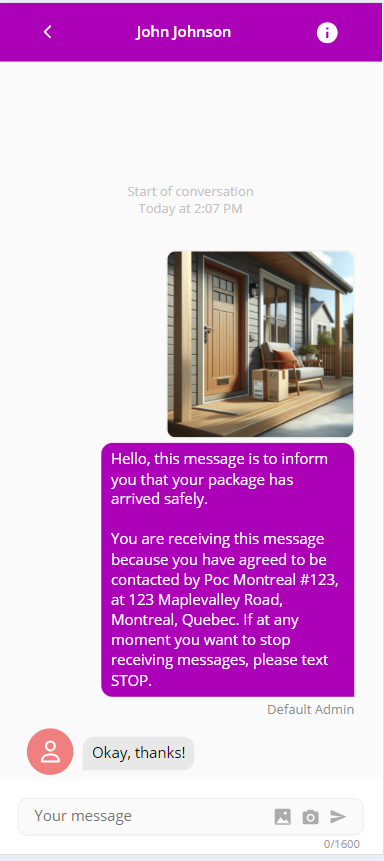
This section is quite similar to any regular messaging app you might be familiar with.
Messages are displayed in speech bubbles, with incoming messages on the left in grey and outbound messages on the right in purple. For outgoing messages, the user's full name will be displayed right under the speech bubble.
If a message contains an attachment, the attachment will be displayed above the message's text. The attachment will be displayed as a preview, and you can click on it to see the full attachment. You can also hover over the attachment to see its title.
Messages are also timestamped, showing the time they were sent or received. The timestamp appears in the middle of the screen, right above the message that was sent or received at that time. If subsequent messages are sent or received in close proximity to the previous ones, they will be grouped together under the same timestamp.
Note: You will also notice that a legal notice text might be appended to the first message of the conversation. For more information on this, please contact your Customer Success Manager.
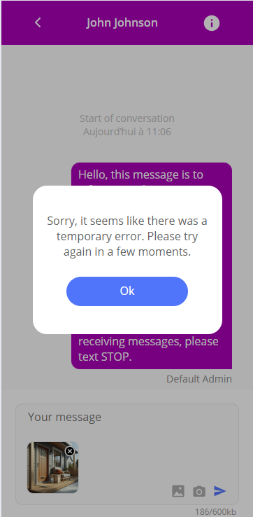
You may also see error icons next to messages. These icons indicate that there was an issue when sending the message. Hovering over the icon will display a tooltip with more information on the error. If you still encounter issues after trying to resend the message, please contact your Customer Success Manager.
Message Input
At the bottom of the Conversation Panel, there is a text box where you can type your message. You can also attach files to your message by clicking on the image icon located on the right side of the text box or choose from already existing message templates your company has set up for you.
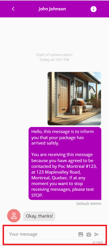
After typing your message, you can send it by clicking the Send button located on the right side of the text box.
Note that you must either provide text or attach a file to be able to send a message. If the text box is empty and no file is attached, the Send button will be disabled and you will be unable to send the message.
You will also notice there is a character counter located on the bottom right of the text box. This counter shows you how many characters you have typed and how many characters you have left before reaching the maximum number of characters allowed in a message. If you try to send a message that exceeds the maximum number of characters, you will receive a pop-up indicating that the message is too long and exceeds the character limit.
Between the text box and the Send button, there are a few action buttons.
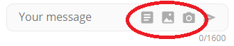
Here is a list of the available action buttons, in order from left to right:
- The Template button allows you to choose from already existing message templates your company has set up for you.
- Selecting a template will replace any text you have typed in the text box, but will not remove any attachments you have added.
- Selecting a template will not automatically send the message, allowing you to review and edit the message before sending it.
- The Image button allows you to attach images to your message.
- The Camera button allows you to take a picture with your device's camera and attach it to your message.
See the MMS Support section for more information on supported content types and limitations when sending messages with attachments.
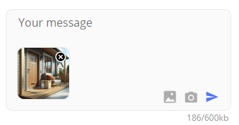
If you are using any attachments, you will see a preview of them below the text box. You can remove an attachment by clicking the X button located on the top right of the attachment's preview.
You might see error popups when sending messages. These popups will inform you of any issues that might have occurred when sending the message. Try again later, and if you still encounter issues, please contact your Customer Success Manager.
Opening the Conversation Details Panel
You can access the Conversation Details Panel by clicking on the information icon located at the top right of the Conversation Panel.
Conversation Details Panel
Conversation Information
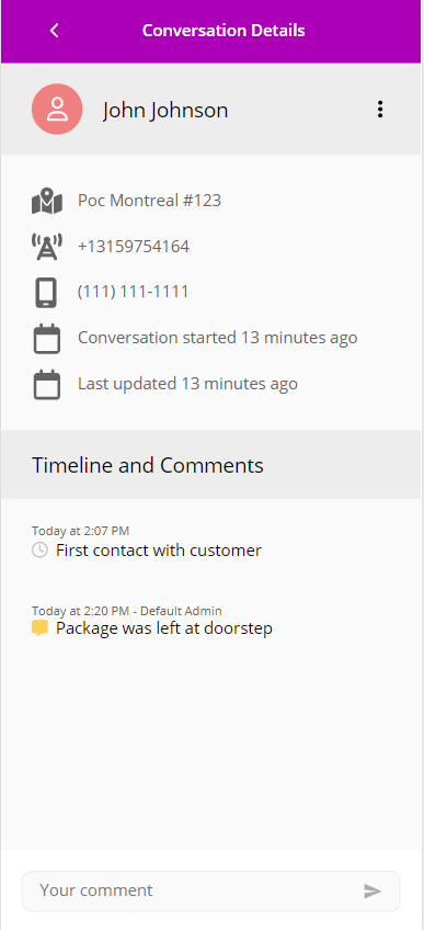
In this section, you will see information about the conversation you are currently viewing:
- The title of the conversation (if it has one, otherwise the customer's phone number will be displayed instead).
- The point of contact the conversation is assigned to.
- The phone number of the app (the phone number that will appear on the customer's phone).
- The phone number of the customer you are conversing with.
- When the conversation was started.
- When the conversation was last updated.
Furthermore, you can access actions related to the conversation by clicking on the vertical ellipsis icon located at the top right of the conversation's name.
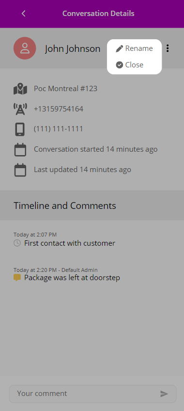
This will open a small menu with the following options:
- Rename: Allows you to rename the conversation.
- Upon clicking this option, the conversation's title will become editable. After typing the new title, you can save it by clicking the green checkmark icon or cancel the operation by clicking anywhere else on the screen.
- Close: Closes the conversation. See the Closed Conversations section for more information on closed conversations.
- If the conversation is closed, this option will be replaced by the Reopen option.
Timeline and Comments
Under the conversation information, you will see a timeline of the conversation. This timeline will contain the timestamps of when the conversation was started and when it was last updated.
Furthermore, you can add comments in the message input box located at the bottom of this section. These comments will also appear in the timeline and will be visible to anyone who has access to view this conversation.
This message input box is similar to the one detailed in the Message Input section, but it does not have any action buttons. You can only type text and send it by clicking the Send button.
Closed Conversations
A Conversation can be closed by a user of the platform as described in the Conversation Information section. When a conversation is closed, it will no longer appear in the Conversation List unless you are specifically filtering for closed conversations. The same method can be used to reopen a closed conversation.
Closing a conversation does not delete it; it simply hides it from the Conversation List to reduce clutter.
When a new message is sent in a closed conversation, the conversation will automatically be reopened and will appear in the Conversation List again. When receiving a message in a closed conversation, the conversation will only be reopened if there are no existing and opened conversations with the same phone number.
MMS Support
The Live Conversations feature supports sending and receiving messages with attachments via MMS. The following content types are supported: - Images (.jpeg, .jpg, .png)
However, these restrictions apply when sending messages with attachments. When receiving messages with attachments, there might be instances where you are able to receive attachments of other file types. These limitations were put in place to ensure the best experience when using the Live Conversations feature across all devices and mobile carriers.
To avoid issues when sending messages with attachments, a limit of 10 attachments per message has been set. Furthermore, you cannot exceed a total size of 600 KB per message.
When adding attachments to a message, the attachments will be compressed to reduce their size. This will allow you to send bigger pictures, but this process takes some time.
Any attached images will have a preview displayed below the text box:
However, an image that has not finished loading will not have an attached preview, and will instead display a placeholder image:
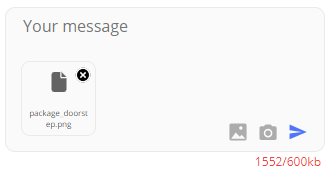
Be aware that larger attachments will take longer to load.
Make sure all attachments you are sending have finished loading before sending the message. If you attempt to send a message with an attachment that has not finished loading, there might be issues that may occur when sending the message.